Guidance
The UNHCR Data Visualization Guidelines are practical and easy to follow. They will ensure your charts and graphics are professional, clear and brand–compliant.
See more
Chart types
Finding the most effective way to showcase your data and convey your message can be a daunting task. In the chart gallery, you can browse through different options and find suitable charts for the type of data you have and the attributes and relationships you want to highlight.
See more
Resources
To help UNHCR colleagues to create high-quality, brand-compliant charts and graphics, GDS has created a number of tools, templates. You can find useful tools to support your data visualization using Excel, Power BI, Adobe Illustrator, and for GIS.
See more
Tutorials
To assist you in creating high-quality, effective data visualizations, this section offers a variety of scripts. Explore our extensive code examples to support your data visualization needs. Whether you're working on statistical analysis, interactive plots, or dynamic graphics, you'll find the resources you need to showcase your data with clarity and precision.
See more
Product gallery
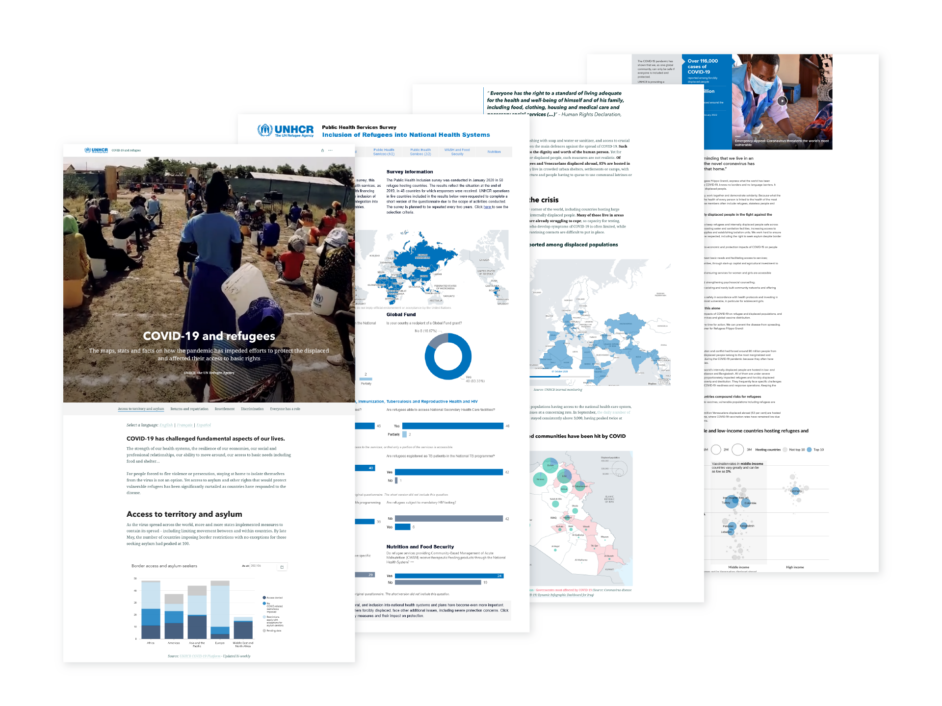
Browse through the collection of storymaps, dashboards and infographics created by UNHCR’s Information Product Development and Analysis unit. Perhaps they can inspire your data storytelling?
See more