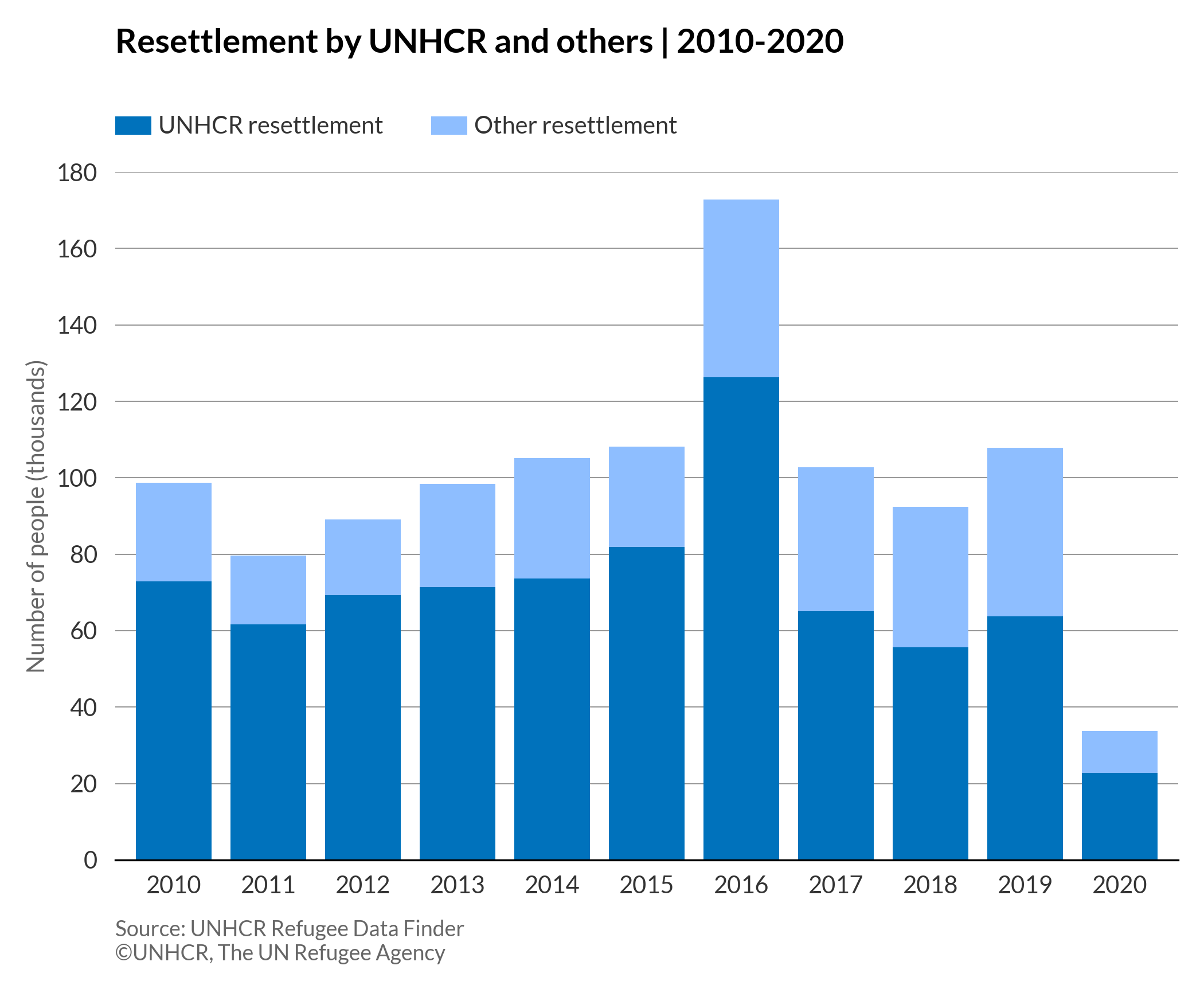
Basic stacked column chart
# import libraries
import matplotlib.pyplot as plt
import pandas as pd
plt.style.use(['unhcrpyplotstyle', 'column'])

#load data set
df = pd.read_csv('https://raw.githubusercontent.com/GDS-ODSSS/unhcr-dataviz-platform/master/data/comparison/column_stacked.csv')

#reshape df from long to wide
df = df.pivot(index='year', columns='rst_type', values='rst_in_thousand')
df = df.reset_index()

#compute data array for plotting
x = df['year']
y1 = df['UNHCR resettlement']
y2 = df['Other resettlement']

#plot the chart
fig, ax = plt.subplots()
rect1=ax.bar(x, y1, label='UNHCR resettlement')
rect2=ax.bar(x, y2, bottom=y1, label='Other resettlement')

#set chart title
ax.set_title('Resettlement by UNHCR and others | 2010-2020', pad=50)

#set chart legend
ax.legend(loc=(0,1.05), ncol=2)

#set y-axis title
ax.set_ylabel('Number of people (thousands)')

#set tick label
ax.tick_params(labelleft=True)

#set x-axis tick and label
ax.set_xticks(x)

#set x-axis limit
ylimit = plt.ylim(0, 180)

#show grid below the bars
ax.grid(axis='y')

#set chart source and copyright
plt.annotate('Source: UNHCR Refugee Data Finder', (0,0), (0, -25), xycoords='axes fraction', textcoords='offset points', va='top', color = '#666666', fontsize=9)
plt.annotate('©UNHCR, The UN Refugee Agency', (0,0), (0, -35), xycoords='axes fraction', textcoords='offset points', va='top', color = '#666666', fontsize=9)

#adjust chart margin and layout
fig.tight_layout()

# Save the figure to the specified path
fig.savefig('plot/stacked-column-basic.png')

#show chart
plt.show()
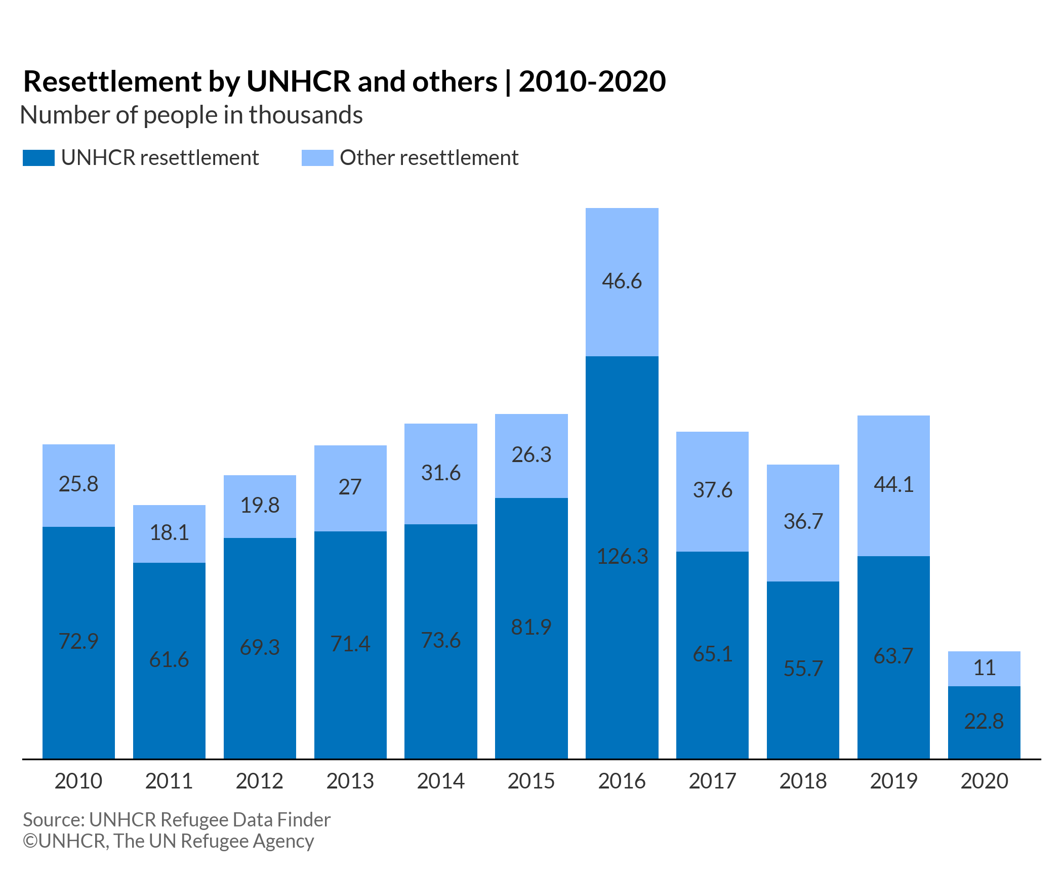
Stacked column chart with data label
# import libraries
import matplotlib.pyplot as plt
import pandas as pd
plt.style.use(['unhcrpyplotstyle','column'])

#load data set
df = pd.read_csv('https://raw.githubusercontent.com/GDS-ODSSS/unhcr-dataviz-platform/master/data/comparison/column_stacked.csv')

#reshape df from long to wide
df = df.pivot(index='year', columns='rst_type', values='rst_in_thousand')
df = df.reset_index()

#prepare data array for plotting
x = df['year']
y1 = df['UNHCR resettlement']
y2 = df['Other resettlement']

#plot the chart
fig, ax = plt.subplots()
rect1=ax.bar(x, y1, label='UNHCR resettlement')
rect2=ax.bar(x, y2, bottom=y1, label='Other resettlement')

#set chart title
ax.set_title('Resettlement by UNHCR and others | 2010-2020', pad=50)

#set subtitle
plt.suptitle('Number of people in thousands', x=0.18, y=0.88)

#set chart legend
ax.legend(loc=(0,1.05), ncol=2)

#set x-axis tick and label
ax.set_xticks(x)

#set formatted data label
ax.bar_label(rect1, label_type='center')
ax.bar_label(rect2, label_type='center')

#set chart source and copyright
plt.annotate('Source: UNHCR Refugee Data Finder', (0,0), (0, -25), xycoords='axes fraction', textcoords='offset points', va='top', color = '#666666', fontsize=9)
plt.annotate('©UNHCR, The UN Refugee Agency', (0,0), (0, -35), xycoords='axes fraction', textcoords='offset points', va='top', color = '#666666', fontsize=9)

#adjust chart margin and layout
fig.tight_layout()

# Save the figure to the specified path
fig.savefig('plot/stacked-column-labels.png')

#show chart
plt.show()