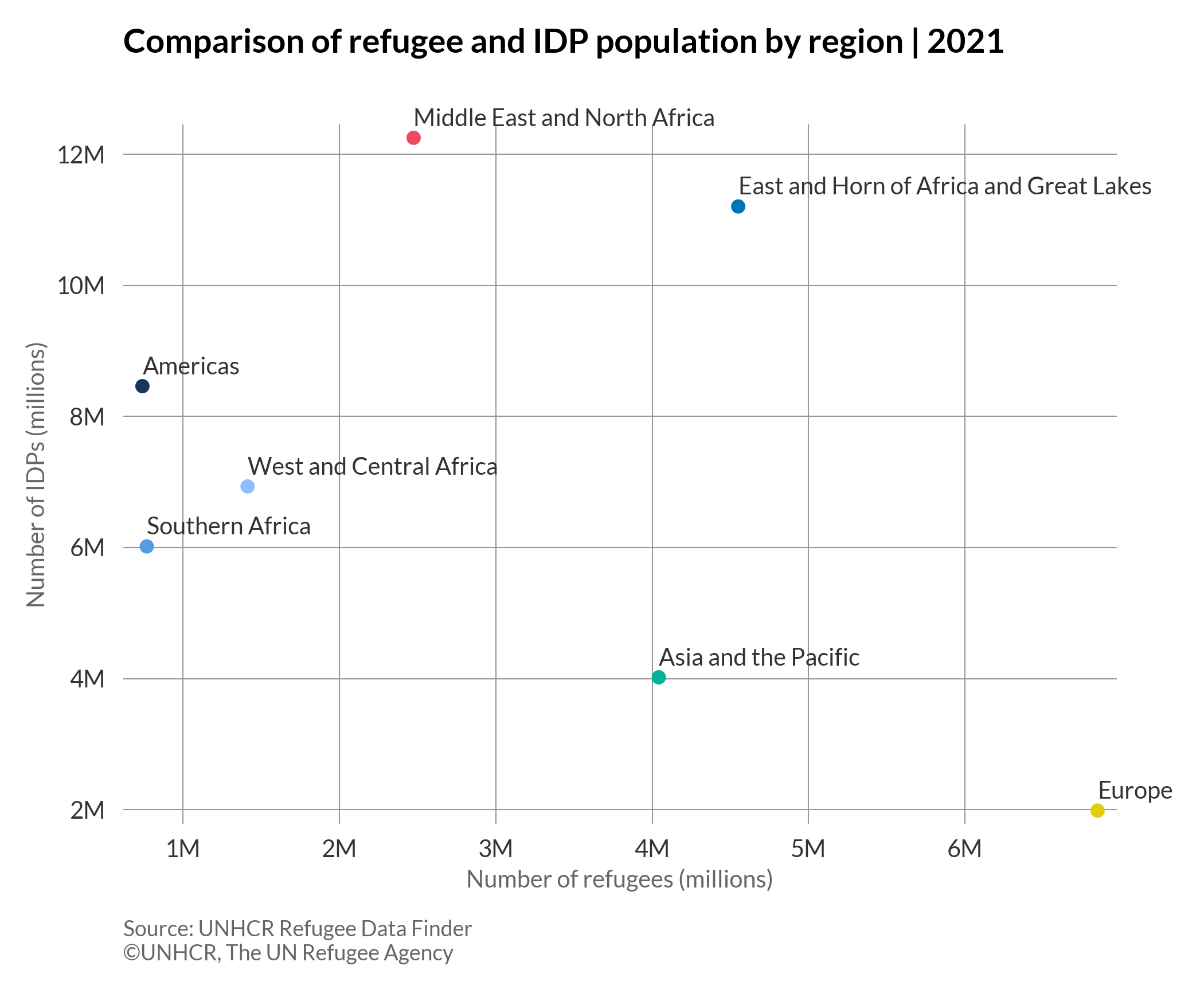
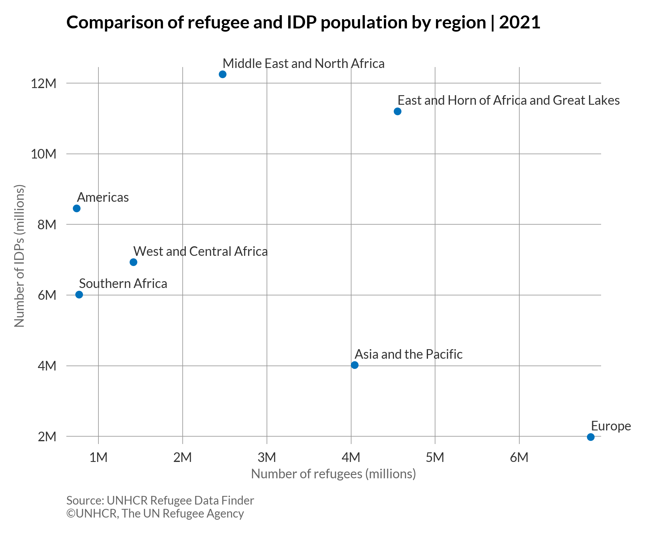
Bubble chart
A bubble chart displays multi-dimensional data in a two-dimensional plot. It can be considered as a variation of the scatterplot, in which the dots are replaced with bubbles. However, unlike a scatterplot which has only two variables defined by the X and Y axis, on a bubble chart each data point (bubble) can be assigned with a third variable (by size of bubble) and a fourth variable (by colour of bubble).
More about: Bubble chart - Other tutorials: R D3
Bubble chart
# import libraries
import matplotlib.pyplot as plt
import pandas as pd
plt.style.use(['unhcrpyplotstyle','bubble'])

#load data set
df = pd.read_csv('https://raw.githubusercontent.com/GDS-ODSSS/unhcr-dataviz-platform/master/data/correlation/bubble.csv')

#compute data array for plotting
x = df['refugee_number']
y = df['idp_number']
size = df['total_number']
label = df['region']

#plot the chart
fig, ax = plt.subplots()
ax.scatter(x, y, s=size/70000)

# Loop for annotation of all points
for i in range(len(x)):
    plt.annotate(label[i], (x[i], y[i]), textcoords="offset points", xytext=(0,10), ha='left')

#set chart title
ax.set_title('Comparison of refugee and IDP population by region | 2021')

#set axis label
ax.set_xlabel('Number of refugees (millions)')
ax.set_ylabel('Number of IDPs (millions)')

#format axis tick labels
def number_formatter(x, pos):
    if x >= 1e6:
        s = '{:1.0f}M'.format(x*1e-6)
    elif x < 1e6 and x > 0:
        s = '{:1.0f}K'.format(x*1e-3)
    else:
        s = '{:1.0f}'.format(x)
    return s
ax.xaxis.set_major_formatter(number_formatter)
ax.yaxis.set_major_formatter(number_formatter)

#set chart source and copyright
plt.annotate('Source: UNHCR Refugee Data Finder', (0,0), (0, -40), xycoords='axes fraction', textcoords='offset points', va='top', color = '#666666', fontsize=9)
plt.annotate('©UNHCR, The UN Refugee Agency', (0,0), (0, -50), xycoords='axes fraction', textcoords='offset points', va='top', color = '#666666', fontsize=9)

#adjust chart margin and layout
fig.tight_layout()

# Save the figure to the specified path
fig.savefig('plot/bubble.png')

#show chart
plt.show()
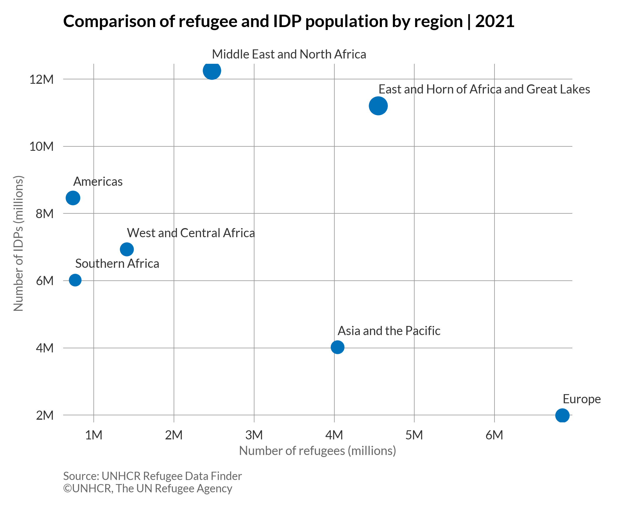
Bubble chart with colours
# import libraries
import matplotlib.pyplot as plt
import pandas as pd
plt.style.use(['unhcrpyplotstyle','bubble'])

#load data set
df = pd.read_csv('https://raw.githubusercontent.com/GDS-ODSSS/unhcr-dataviz-platform/master/data/correlation/bubble.csv')

#compute data array for plotting
x = df['refugee_number']
y = df['idp_number']
size = df['total_number']
label = df['region']

#set colour palette
colour = ['#00B398','#E1CC0D','#589BE5','#18375F','#0072BC','#EF4A60','#8EBEFF']

#plot the chart
fig, ax = plt.subplots()
ax.scatter(x, y, s=size/70000, c=colour)

# Loop for annotation of all points
for i in range(len(x)):
    plt.annotate(label[i], (x[i], y[i]), textcoords="offset points", xytext=(0,10), ha='left')

#set chart title
ax.set_title('Comparison of refugee and IDP population by region | 2021')

#set axis label
ax.set_xlabel('Number of refugees (millions)')
ax.set_ylabel('Number of IDPs (millions)')

#format axis tick labels
def number_formatter(x, pos):
    if x >= 1e6:
        s = '{:1.0f}M'.format(x*1e-6)
    elif x < 1e6 and x > 0:
        s = '{:1.0f}K'.format(x*1e-3)
    else:
        s = '{:1.0f}'.format(x)
    return s
ax.xaxis.set_major_formatter(number_formatter)
ax.yaxis.set_major_formatter(number_formatter)

#set chart source and copyright
plt.annotate('Source: UNHCR Refugee Data Finder', (0,0), (0, -40), xycoords='axes fraction', textcoords='offset points', va='top', color = '#666666', fontsize=9)
plt.annotate('©UNHCR, The UN Refugee Agency', (0,0), (0, -50), xycoords='axes fraction', textcoords='offset points', va='top', color = '#666666', fontsize=9)

#adjust chart margin and layout
fig.tight_layout()

# Save the figure to the specified path
fig.savefig('plot/bubble-colour.png')

#show chart
plt.show()
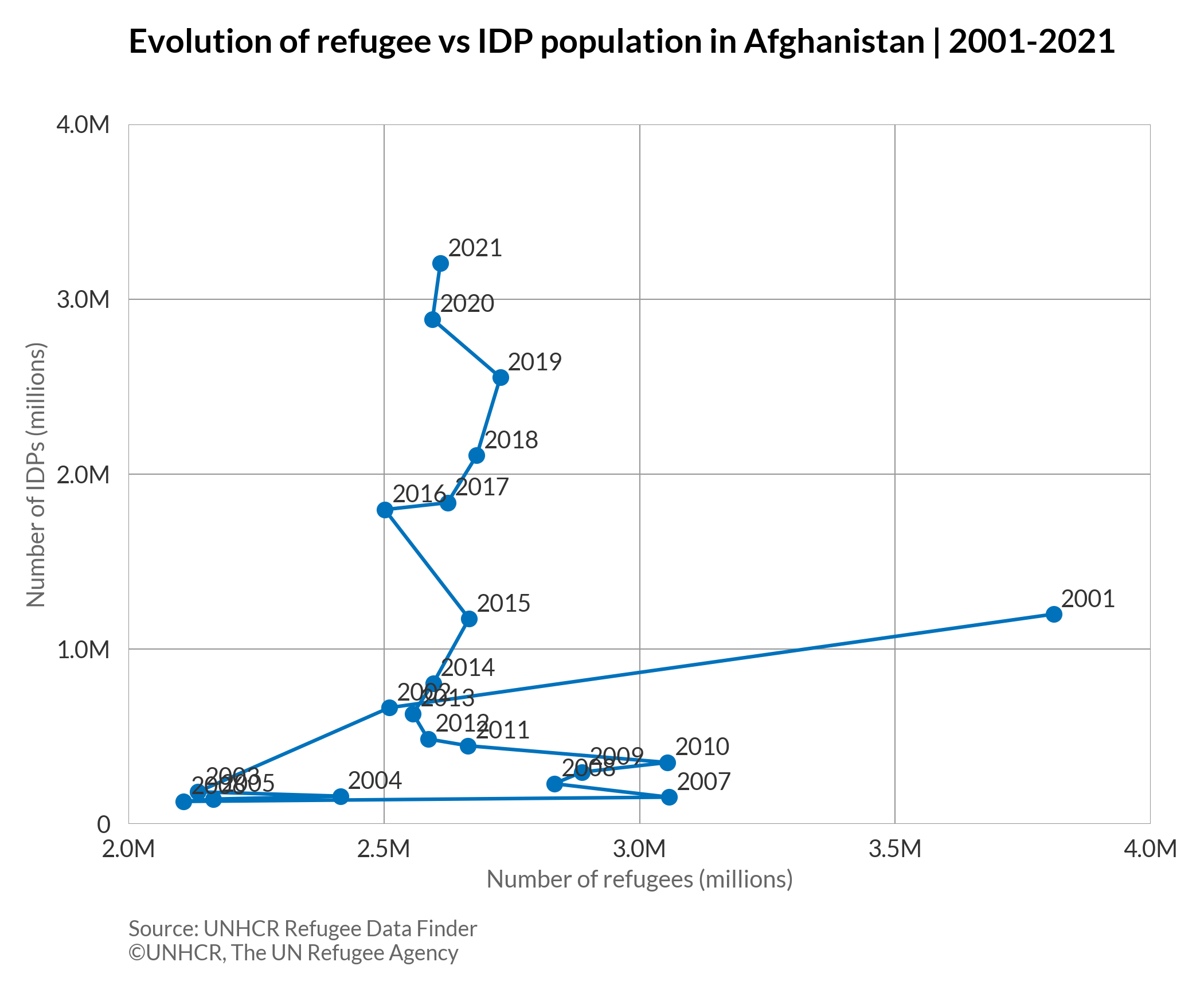
Connected scatterplot
A connected scatterplot is a type of visualization that displays the evolution of a series of data points that are connected by straight line segments. In some cases, it is not the most intuitive to read; but it is impressive for storytelling.
More about: Connected scatterplot - Other tutorials: R D3
# import libraries
import matplotlib.pyplot as plt
import pandas as pd
from matplotlib.ticker import MaxNLocator
plt.style.use(['unhcrpyplotstyle', 'connected_scatterplot'])

#load data set
df = pd.read_csv('https://raw.githubusercontent.com/GDS-ODSSS/unhcr-dataviz-platform/master/data/correlation/scatterplot_connected.csv')

#compute data array for plotting
x = df['refugee_number']
y = df['idp_number']
z = df['year']

#plot the chart
fig, ax = plt.subplots()
ax.plot(x, y, marker='o')

# Loop for annotation of all points
for i in range(len(x)):
    plt.annotate(z[i], (x[i], y[i]), textcoords="offset points", xytext=(3,3), ha='left')

limx = plt.xlim(2000000, 4000000)
limy = plt.ylim(0, 4000000)

#set chart title
ax.set_title('Evolution of refugee vs IDP population in Afghanistan | 2001-2021')

#set axis label
ax.set_xlabel('Number of refugees (millions)')
ax.set_ylabel('Number of IDPs (millions)')

#format axis tick labels
def number_formatter(x, pos):
    if x >= 1e6:
        s = '{:1.1f}M'.format(x*1e-6)
    elif x < 1e6 and x > 0:
        s = '{:1.1f}K'.format(x*1e-3)
    else:
        s = '{:1.0f}'.format(x)
    return s
ax.xaxis.set_major_formatter(number_formatter)
ax.yaxis.set_major_formatter(number_formatter)
ax.xaxis.set_major_locator(MaxNLocator(4))
ax.yaxis.set_major_locator(MaxNLocator(4))

#set chart source and copyright
plt.annotate('Source: UNHCR Refugee Data Finder', (0,0), (0, -40), xycoords='axes fraction', textcoords='offset points', va='top', color = '#666666', fontsize=9)
plt.annotate('©UNHCR, The UN Refugee Agency', (0,0), (0, -50), xycoords='axes fraction', textcoords='offset points', va='top', color = '#666666', fontsize=9)

#adjust chart margin and layout
fig.tight_layout()

# Save the figure to the specified path
fig.savefig('plot/connected-scatterplot.png')

#show chart
plt.show()
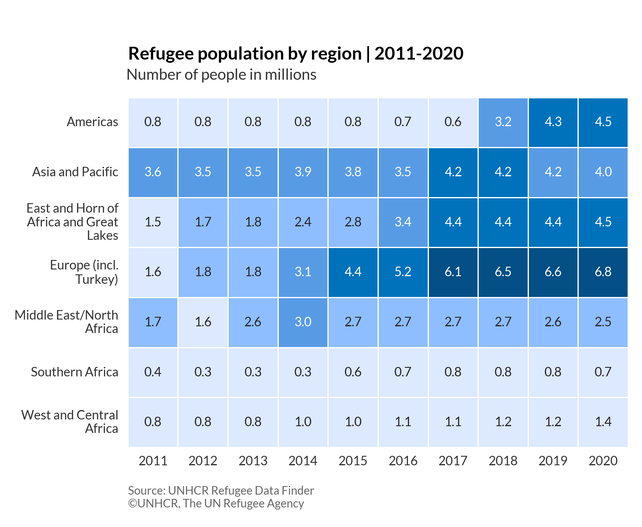
Heatmap
A heatmap is a type of visualization that values are depicted through variations in colour within a two-dimensional matrix of cells. It allows us to visualize complex data and understand it at a glance.
# import libraries
import matplotlib.pyplot as plt
import seaborn as sns
import pandas as pd
from textwrap import wrap
plt.style.use(['unhcrpyplotstyle', 'heatmap'])

# Load and reshape data set
df = pd.read_csv('https://raw.githubusercontent.com/GDS-ODSSS/unhcr-dataviz-platform/master/data/correlation/heatmap.csv')
df = df.pivot(index='location', columns='year', values='values')

# Wrap the long labels
y = ['Americas', 'Asia and Pacific', 'East and Horn of Africa and Great Lakes', 'Europe (incl. Turkey)', 'Middle East/North Africa', 'Southern Africa', 'West and Central Africa']
y = ['\n'.join(wrap(l, 20)) for l in y]

# Plot the chart
fig, ax = plt.subplots()
ax = sns.heatmap(df, annot=True, linewidths=.5, yticklabels=y, square=True, cmap=['#DCE9FF', '#8EBEFF', '#589BE5', '#0072BC', '#044F85'], cbar=False, fmt=".1f")

# Set chart title
ax.set_title('Refugee population by region | 2011-2020')

# Set subtitle
plt.suptitle('Number of people in millions', x=0.345, y=0.87)

# Set axis label
ax.set_xlabel('')
ax.set_ylabel('')

# Set chart source and copyright
plt.annotate('Source: UNHCR Refugee Data Finder', (0, 0), (0, -30), xycoords='axes fraction', textcoords='offset points', va='top', color='#666666', fontsize=9)
plt.annotate('©UNHCR, The UN Refugee Agency', (0, 0), (0, -40), xycoords='axes fraction', textcoords='offset points', va='top', color='#666666', fontsize=9)

# Adjust chart margin and layout
fig.tight_layout()

# Save the figure to the specified path
fig.savefig('plot/heatmap.png')

#show chart
plt.show()
Scatterplot
A scatterplot is a type of visualization using Cartesian Coordinates to display two variables for a set of data. The data are displayed as a collection of dots. The position of each dot on the horizontal and vertical axis indicates the values for an individual data point.
More about: Scatterplot - Other tutorials: R D3
Basic scatterplot
# import libraries
import matplotlib.pyplot as plt
import pandas as pd
plt.style.use(['unhcrpyplotstyle','scatterplot'])

#load data set
df = pd.read_csv('https://raw.githubusercontent.com/GDS-ODSSS/unhcr-dataviz-platform/master/data/correlation/scatterplot.csv')

#compute data array for plotting
x = df['refugee_number']
y = df['idp_number']
label = df['region']

#plot the chart
fig, ax = plt.subplots()
ax.scatter(x, y, s=30)

# Loop for annotation of all points
for i in range(len(x)):
    plt.annotate(label[i], (x[i], y[i]), textcoords="offset points", xytext=(0,5), ha='left')

#set chart title
ax.set_title('Comparison of refugee and IDP population by region | 2021')

#set axis label
ax.set_xlabel('Number of refugees (millions)')
ax.set_ylabel('Number of IDPs (millions)')

#format axis tick labels
def number_formatter(x, pos):
    if x >= 1e6:
        s = '{:1.0f}M'.format(x*1e-6)
    elif x < 1e6 and x > 0:
        s = '{:1.0f}K'.format(x*1e-3)
    else:
        s = '{:1.0f}'.format(x)
    return s
ax.xaxis.set_major_formatter(number_formatter)
ax.yaxis.set_major_formatter(number_formatter)

#set chart source and copyright
plt.annotate('Source: UNHCR Refugee Data Finder', (0,0), (0, -40), xycoords='axes fraction', textcoords='offset points', va='top', color = '#666666', fontsize=9)
plt.annotate('©UNHCR, The UN Refugee Agency', (0,0), (0, -50), xycoords='axes fraction', textcoords='offset points', va='top', color = '#666666', fontsize=9)

#adjust chart margin and layout
fig.tight_layout()

# Save the figure to the specified path
fig.savefig('plot/scatterplot-basic.png')

#show chart
plt.show()
Scatterplot with colours
# import libraries
import matplotlib.pyplot as plt
import pandas as pd
plt.style.use(['unhcrpyplotstyle','scatterplot'])

#load data set
df = pd.read_csv('https://raw.githubusercontent.com/GDS-ODSSS/unhcr-dataviz-platform/master/data/correlation/scatterplot.csv')

#compute data array for plotting
x = df['refugee_number']
y = df['idp_number']
label = df['region']

#set colour palette
colour = ['#00B398','#E1CC0D','#589BE5','#18375F','#0072BC','#EF4A60','#8EBEFF']

#plot the chart
fig, ax = plt.subplots()
ax.scatter(x, y, s=30, c=colour)

# Loop for annotation of all points
for i in range(len(x)):
    plt.annotate(label[i], (x[i], y[i]), textcoords="offset points", xytext=(0,5), ha='left')

#set chart title
ax.set_title('Comparison of refugee and IDP population by region | 2021')

#set axis label
ax.set_xlabel('Number of refugees (millions)')
ax.set_ylabel('Number of IDPs (millions)')

#format axis tick labels
def number_formatter(x, pos):
    if x >= 1e6:
        s = '{:1.0f}M'.format(x*1e-6)
    elif x < 1e6 and x > 0:
        s = '{:1.0f}K'.format(x*1e-3)
    else:
        s = '{:1.0f}'.format(x)
    return s
ax.xaxis.set_major_formatter(number_formatter)
ax.yaxis.set_major_formatter(number_formatter)

#set chart source and copyright
plt.annotate('Source: UNHCR Refugee Data Finder', (0,0), (0, -40), xycoords='axes fraction', textcoords='offset points', va='top', color = '#666666', fontsize=9)
plt.annotate('©UNHCR, The UN Refugee Agency', (0,0), (0, -50), xycoords='axes fraction', textcoords='offset points', va='top', color = '#666666', fontsize=9)

#adjust chart margin and layout
fig.tight_layout()

# Save the figure to the specified path
fig.savefig('plot/scatterplot-colour.png')

#show chart
plt.show()